

Graffiti has evolved over decades from underground art to a mainstream cultural phenomenon. Within this vibrant street art movement, various styles have emerged, each with its own distinct characteristics and techniques. One such style is the graffiti throw up alphabet, a fast-paced, bold form of lettering that has become iconic in the graffiti world.
In this article, we’ll dive into what graffiti throw-ups are, how the alphabet plays a crucial role, and how this style differs from other graffiti styles like tags and pieces. Whether you’re an aspiring artist or a graffiti enthusiast, understanding the throw-up alphabet can open up a new world of creativity and expression.
Advertisement
What is Graffiti Throw Up?
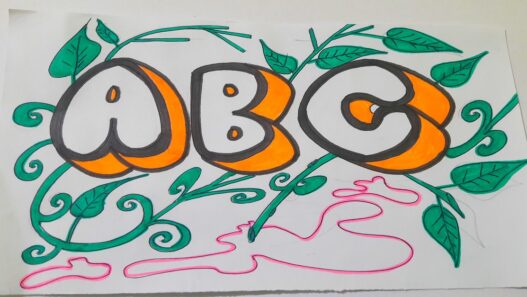
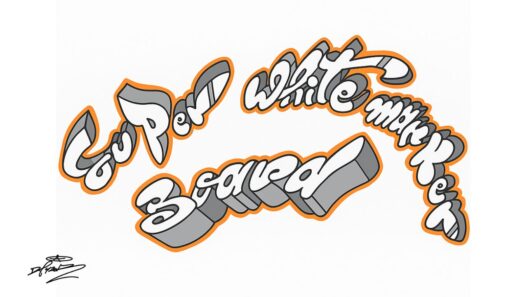
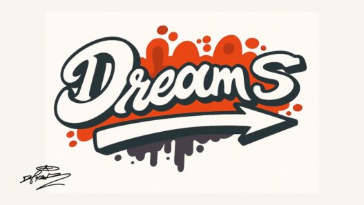
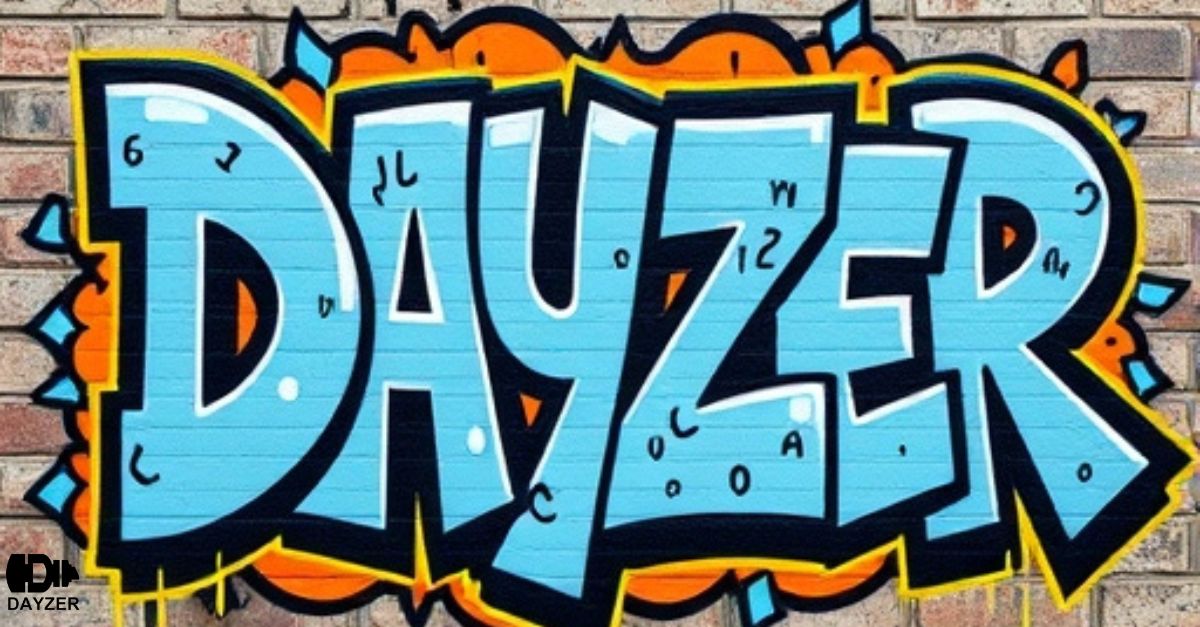
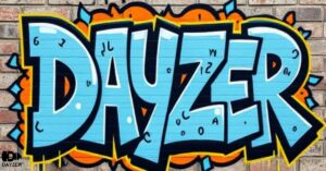
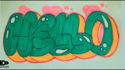
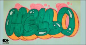
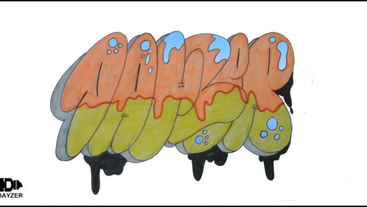
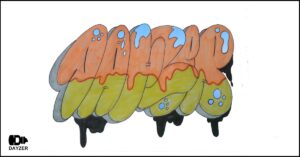
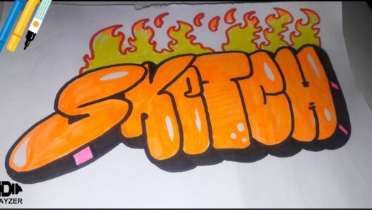
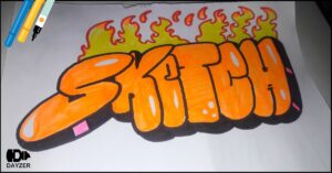
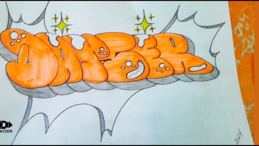
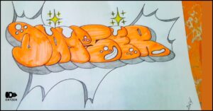
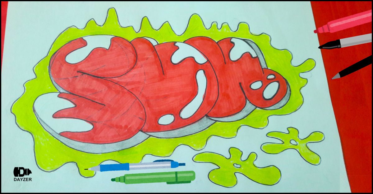
A throw-up refers to a quick, simple, and bold style of writing in graffiti culture. Artists create throw-ups for speed and impact, unlike intricate graffiti pieces that take more time and effort.Artists use thick, rounded letters that are easy to paint quickly, often using a two-tone color scheme to make them stand out.
Throw-ups are often a step up from a tag (a personal signature) but much less complex than a full-fledged mural or graffiti piece. The goal is efficiency — creating something noticeable without the time commitment that detailed work requires.
The Role of the Alphabet in Graffiti Throw-Ups
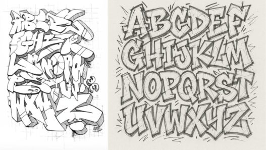
The graffiti throw-up alphabet is essential to the creation of these quick, stylized letters. Artists manipulate the standard alphabet by using bold, exaggerated shapes and forms, often with overlapping letters or rounded edges to maximize legibility and visual impact. These alphabets are easy to read from a distance, which is crucial in the fast-paced world of street art, where visibility is key.
Each letter in the graffiti throw-up alphabet is designed to be painted quickly and efficiently, often using spray paint or markers. The style allows for some flexibility — graffiti artists may add their own flair to each letter while still maintaining the overall simplicity that defines throw-ups.
The Evolution of the Graffiti Throw Up Alphabet
Over time, the graffiti throw-up alphabet has evolved, with artists experimenting with different letter styles and embellishments. Some artists incorporate shadows, highlights, or bubble-like shapes to give their throw-ups more dimension and depth. Others may opt for a more minimalist approach, relying on simple, clean lines.
While the throw-up alphabet remains one of the quickest forms of graffiti, it also serves as a foundation for more complex styles. Many graffiti artists begin with throw-ups to develop their skills before moving on to more intricate pieces, allowing them to refine their understanding of proportions, flow, and color.
Key Characteristics of Graffiti Throw Up Alphabet Style
- Bold and Rounded Letters: Throw-ups typically feature bold, rounded letters that are easy to read and quick to paint.
- Speed and Simplicity: The design prioritizes speed and efficiency, making it ideal for quick tagging and marking territory.
- Two-Tone Color Scheme: Graffiti throw-ups often use two-tone color schemes for added contrast, with the background and letter colors complementing each other.
- Graffiti artists design the letters to be visible from a distance, focusing on making them easy to read even in busy urban environments.
Advertisement
FAQs About Graffiti Throw Up Alphabet
1. What is a graffiti throw-up alphabet?
A graffiti throw-up alphabet is a simplified, bold style of lettering used in street art. Artists create large, rounded letters that are quick to paint, often using spray paint. This style is designed for maximum visibility and speed.
2. How is a throw-up different from a tag in graffiti?
A tag is a quick, stylized signature of a graffiti artist, usually written in a single line or with minimal design. A throw-up, on the other hand, is a larger, more stylized form of writing that is faster to create than a full-fledged graffiti piece but more complex than a tag.
3. Why do graffiti artists use two-tone colors for throw-ups?
The two-tone color scheme is used to enhance the contrast between the letters and the background. This makes the throw-up more visible and impactful, helping it stand out in busy urban environments.
4. Can the graffiti throw-up alphabet be personalized?
Yes, many graffiti artists add their personal flair to the throw-up alphabet by altering the shape, size, or even the positioning of the letters. This allows them to create unique styles while maintaining the core elements of the throw-up technique.
5.how to draw Graffiti Throw Up Alphabet ?
6. What tools do graffiti artists use for throw-ups?
Graffiti artists typically use spray paint cans for throw-ups, opting for wide spray nozzles to cover large areas quickly. Markers and other tools may also be used for smaller throw-ups or if additional detail is desired.
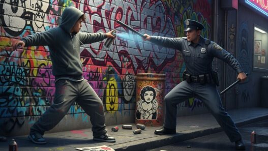
7. Is graffiti throw-up art illegal?
Graffiti, often associated with street art and urban culture, can be illegal depending on the location. Artists are encouraged to seek permission before painting on public or private property to avoid legal repercussions.
8. How can I learn to create graffiti throw-up alphabet letters?
To learn the graffiti throw-up alphabet, practice creating simple, rounded letterforms using bold lines. Study existing throw-ups in your area to understand the common techniques and color schemes. Experiment with different sprays and tools to find what works best for your style.
By understanding the graffiti throw-up alphabet, you’ll appreciate the speed, creativity, and artistry behind these quick but impactful creations. Whether you’re a street artist or simply an admirer of graffiti, this art form continues to inspire and shape urban culture.
share botton: